Higher Ed Website Roundup: 10 Scroll-Worthy Designs to Inspire You
Authored by: Bjorn Thomson and Rosie Gladden.
If you’re on the brink of redesigning or rebuilding your higher ed website, you’ve likely spent months — perhaps even years — doing the legwork to get your project off the ground. Once your plans are approved and you’ve selected a web development partner to bring your vision to life, the fun work can begin.
Soon, you’ll need to review potential designs and wireframes and start making decisions about your website’s future direction. When you do, it’s vital to review them with two essential questions in mind:
- Will this design capture our audience’s attention and inspire them toward action?
- Will this solution meet our business needs and differentiate our institution from the competition?
It can be helpful to draw inspiration from other colleges and universities who’ve gotten this balance right. That’s why we’ve curated a list of ten higher ed websites that marry eye-catching design with a user-focused infrastructure and a compelling, accessible content strategy.
Ready to get inspired? Scroll on.
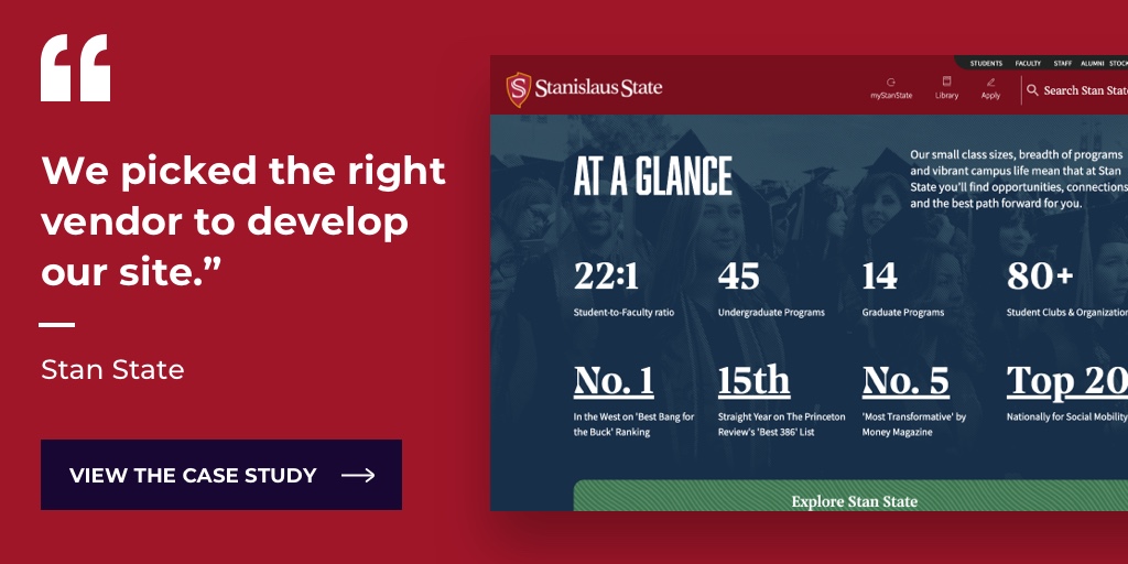
1. California State University, Stanislaus
Stanislaus State’s website is a textbook example of storytelling and engagement. Through compelling narratives, stunning visuals, and interactive design elements, Stan State showcases its impact and invites visitors to be part of it.
Why we love Stan State’s site:
- Clear navigation. A well-organized information architecture ensures visitors can find what they need quickly. Menu categories are intuitive and descriptive to take prospective students, alumni, and donors on their respective user journeys.
- Engaging visuals. Visual content plays a crucial role in capturing visitors' attention and effectively conveying the university's atmosphere. Stan State’s vibrant images and videos help site visitors imagine themselves in this beautiful campus environment.
- Interactive features. Forms, event calendars, and social media integrations all enhance user engagement and interaction and make it easy for visitors to participate in campus activities, explore upcoming events, and connect with the university community.
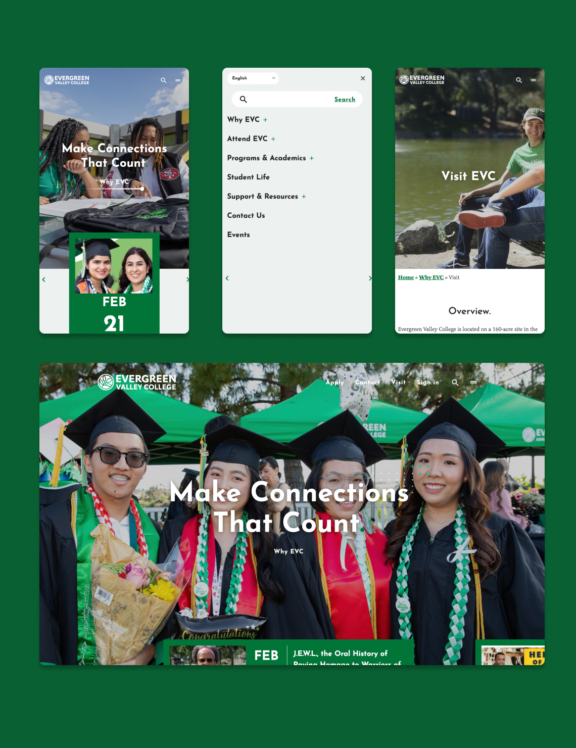
2. Evergreen Valley College
Evergreen Valley’s web design features bold, on-brand photos and graphics combined with a homepage that serves as an inviting springboard for further exploration.
The standout features of Evergreen Valley College include:
- Clean, expertly organized layout. This highly scannable design presents information in a structured, easy-to-absorb manner. The homepage provides fast access to frequently visited pages, while the navigation menu offers a deeper look at everything the site has to offer.
- Prominent calls-to-action (CTAs). There’s nothing passive about Evergreen Valley’s website. From buttons that invite prospective students to begin their journey to cards that say “sign up,” Evergreen Valley’s CTAs are eye-catching, instructive, and plentiful. This action-oriented design strategy helps guide users toward their desired goals while simultaneously improving conversion rates.
- Accessibility. Evergreen Valley’s commitment to accessibility shines through in a variety of ways. Images contain alt text, and content is displayed in digestible, readable formats.
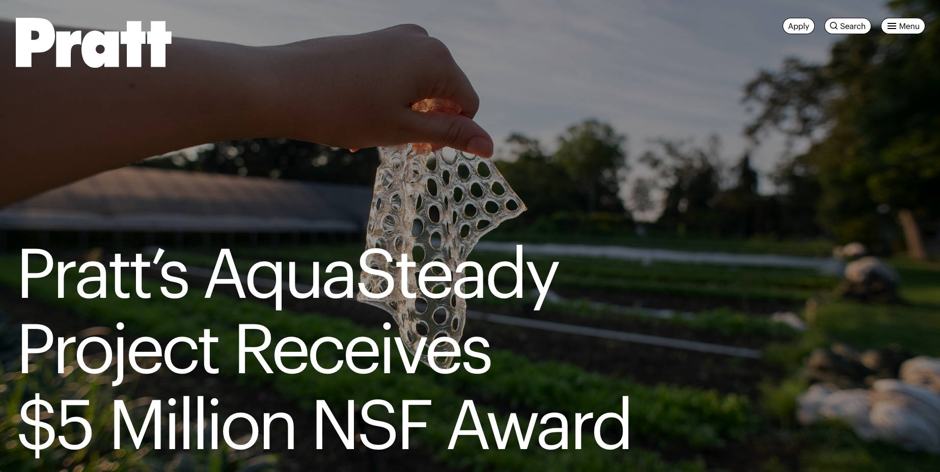
3. Pratt Institute
Differentiation is a huge challenge in the world of higher education. If you’re not careful, it’s easy to create a website that looks and feels like every other college or university site.
In keeping with its creative educational mission, Pratt Institute’s website breaks out of familiar molds to deliver a look and feel that’s truly unique.
The reason we’ve included Pratt Institute:
- A creative and artistic flair. Visiting this website feels a lot like viewing an online art gallery, which is a powerful way to capture and portray Pratt’s ethos. Hero areas on the homepage prominently showcase the work of students and faculty alike.
- Functionality and usability. While Pratt’s homepage invites site visitors to peruse the art that’s on full display, the navigation menu provides clear, easy access to all the standard points of interest for prospective students and their families.
4. Ashland University
“We see you.” That’s the overarching message of the Ashland University website — and it’s communicated in subtle and bold ways. From diverse, inclusive videos and stills to an audience-focused storytelling strategy, Ashland’s website offers a cohesive user experience that’s genuine, inviting, and authentic.
What’s great about Ashland University’s site:
- Sleek, visually engaging design. Stunning visuals juxtaposed with white space and short blocks of text make for a clean, inviting design that’s pleasing to the eye and easy to navigate.
- A warm, personal welcome. In keeping with the “We See You” theme, the opening video carousel features students and faculty greeting one another with big smiles and hugs. Plus, an audio message from the President underscores a top-down commitment to friendliness and openness.
- A mobile-first platform. Ashland’s information architecture makes it easy for students, alumni, staff, and other users to quickly find the content they’re looking for — and is exceptionally mobile-friendly and responsive.
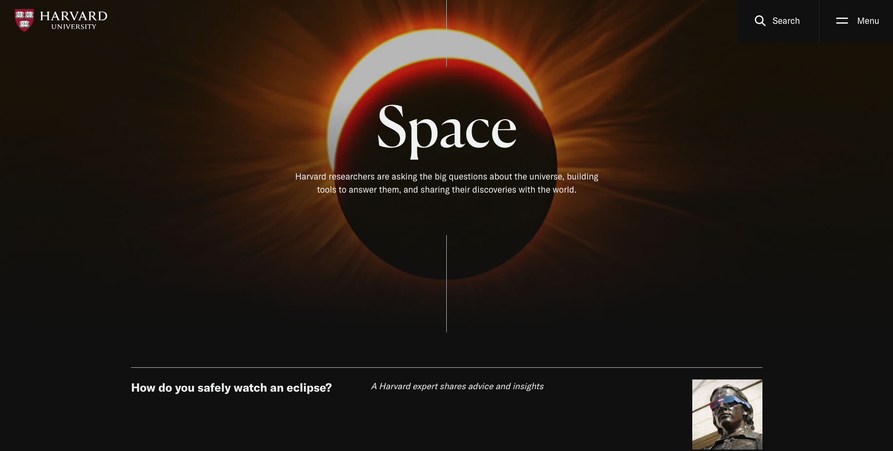
5. Harvard University
Sophisticated and smart. Elegant and stately. Renowned and revered. Harvard’s website conveys its Ivy League status and centuries-long impact with quiet confidence.
The Harvard University site’s standout features include:
- Clean design. Harvard’s refined, minimalist aesthetic lets its content take center stage. With plenty of white space and a streamlined layout, the design exudes a sense of authority befitting Harvard's reputation.
- Intuitive navigation. Exploring Harvard's extensive online presence is seamless and frictionless, thanks to the well-organized information architecture and user-friendly menus.
- Comprehensive content. From detailed course catalogs and faculty biographies to news and events, Harvard’s site offers an expansive wealth of information for a wide audience. This far-reaching content strategy highlights Harvard's commitment to intellectual excellence and its role as a global leader in higher education.
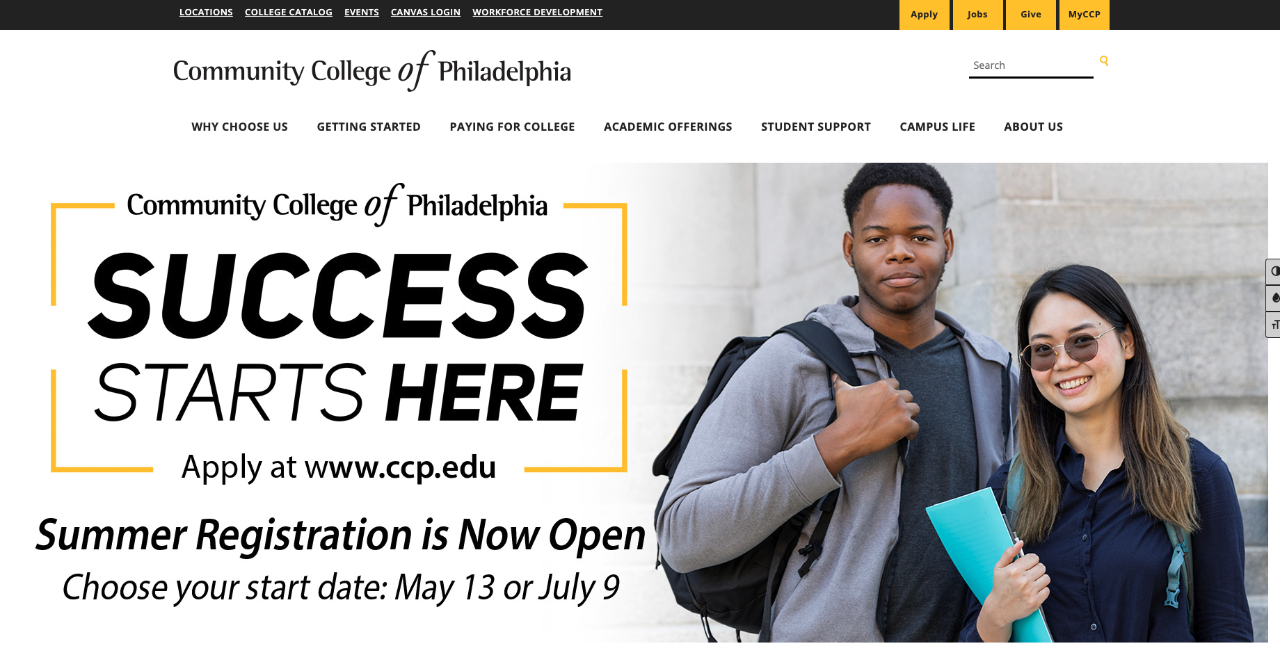
6. Community College of Philadelphia
As a public, open-admission institution, Community College of Philadelphia (CCP) focuses on empowering students to reach their goals. That message is front-and-center on its homepage and throughout the site.
Here’s why we think Community College of Philadelphia is one of the best Higher Ed sites:
- Audience-focused web strategy. CCP demonstrates a deep understanding of its diverse student population and keeps their needs at the forefront of their overarching digital strategy.
- Simplicity and clarity of purpose. Leveraging a straightforward and uncluttered design, CCP presents information in a clear and concise manner, reflecting the college's mission of providing accessible and affordable education.
- Easy access to essential information. Recognizing that many students juggle multiple responsibilities, the website streamlines the process of finding critical information related to admissions, course offerings, student services, and practical courses of study.
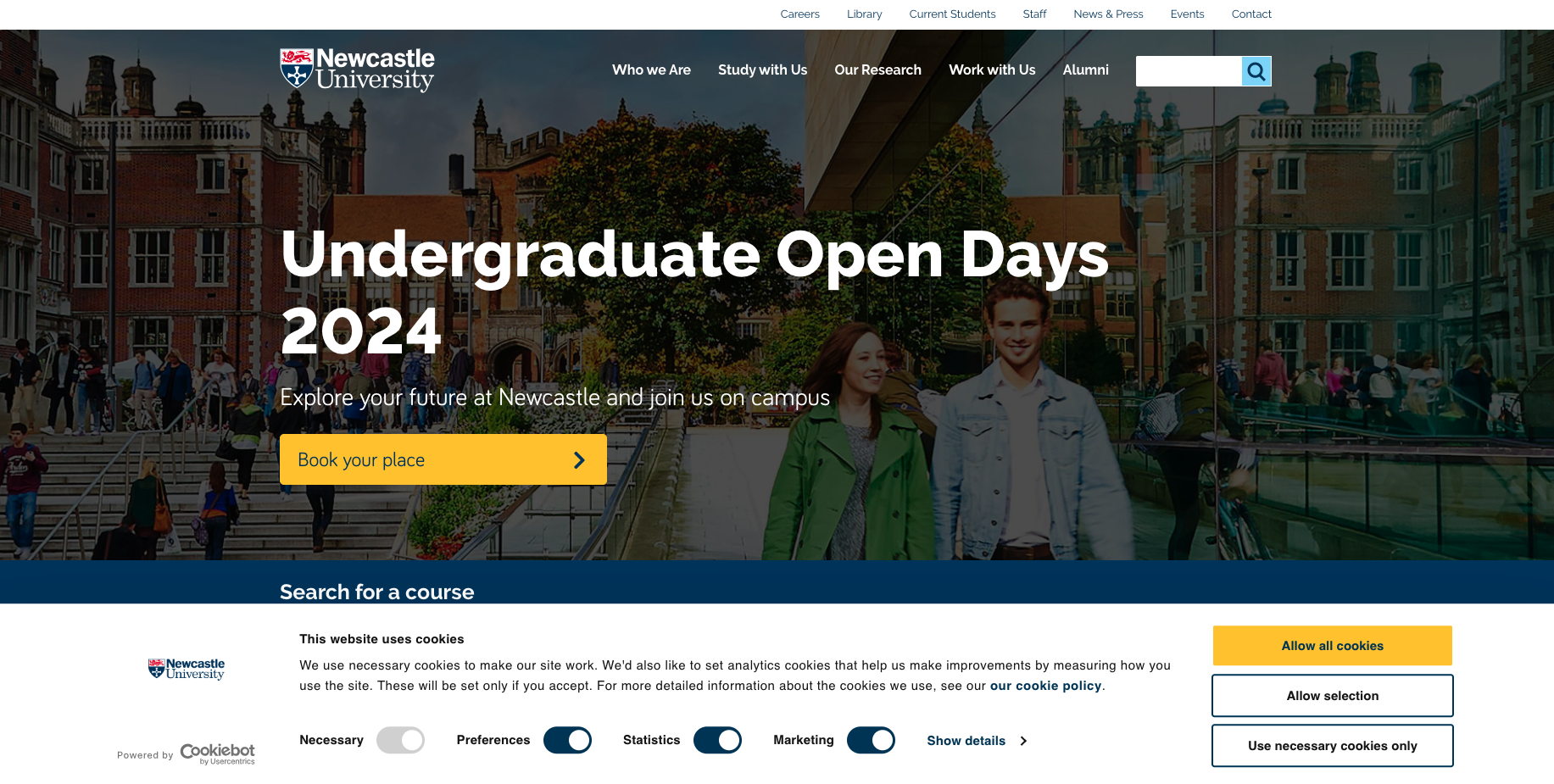
7. Newcastle University
Students make decisions about where to attend college or university primarily based on emotion. They research factors like cost, financial aid, size, location, and available majors. But — at the end of the day — students will ask: Do I belong here? Will I feel at home? What are the people like? Is this school a good fit for me? Newcastle University does an excellent job answering these questions.
An example from across the pond, why we love Newcastle University’s website:
- Student and alumni stories. Using profiles, videos, testimonials, and callout text, Newcastle’s website brings the university's vibrant community to life through inspiring stories, narratives, and experiences from current students and accomplished alumni.
- Search functionality. Students and other site visitors often arrive at a website with specific questions in mind. Newcastle helps its audience find answers to their questions with a robust and intuitive search feature that empowers users to efficiently navigate the wealth of information and resources available.
- Smart use of metadata. Newcastle University's website showcases meticulous attention to behind-the-scenes details that improve the overall user experience. By incorporating metadata elements such as descriptive tags, structured data, and schema markup, the website speaks the language of Google’s algorithm while also giving site visitors faster access to the key pieces of information they’re searching for.
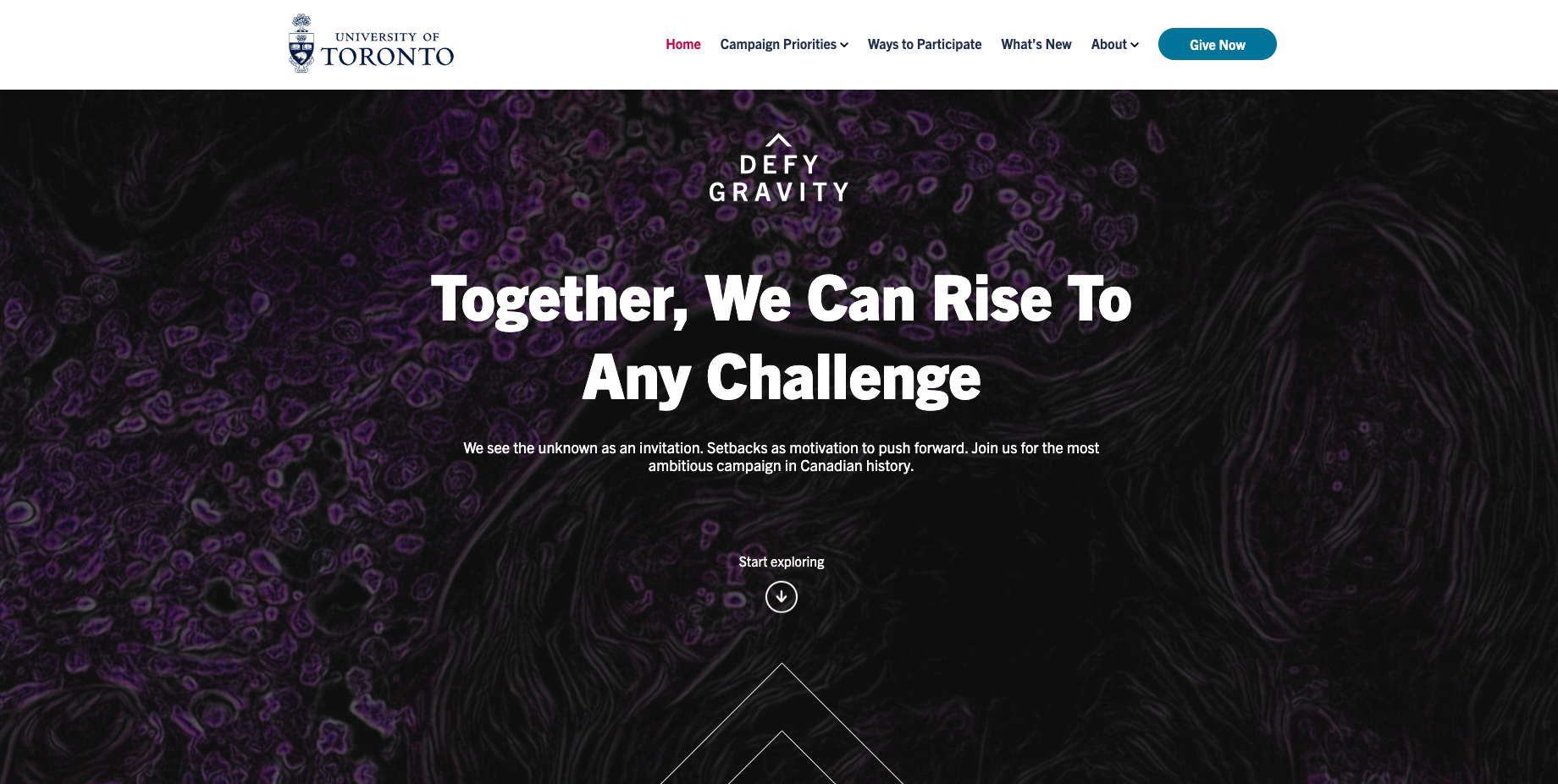
8. University of Toronto — Defying Gravity Campaign
Sometimes you don’t need to reinvent your entire website. You just need to create a microsite or landing page for a specific purpose and for a finite period of time.
The University of Toronto’s Defying Gravity Campaign site heralds the most ambitious fundraising campaign in Canadian history and invites supporters to be part of it.
This microsite’s standout features include:
- Bold, captivating visuals. With its striking imagery and dynamic use of videography, this site captures the campaign’s spirit of pushing boundaries and reaching new heights.
- Consistent branding and messaging. By seamlessly integrating the university's brand identity, the University of Toronto’s campaign microsite reinforces its message of excellence, innovation, and ambition. Note how the site's color palette, typography, and overall aesthetic align cohesively with institutional branding to create a unified and impactful experience.
- Storytelling through multimedia. This site leverages a range of multimedia elements — infographics, podcasts, video testimonials, and more — to engage visitors and convey the university's impact.
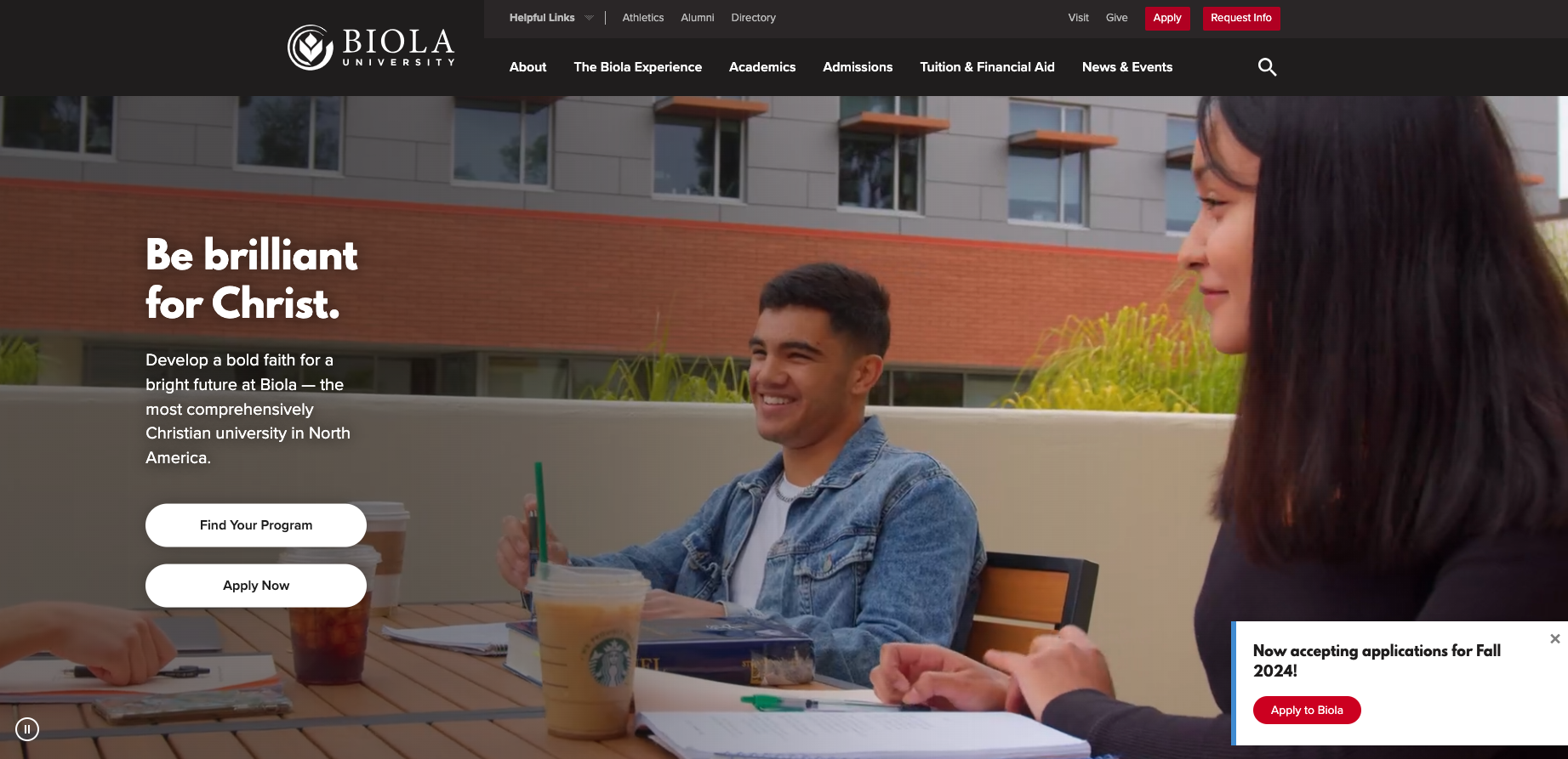
9. Biola University
Biola University's website prioritizes a straightforward and intuitive navigation structure, ensuring that prospective students, current students, and other visitors can effortlessly find the information they seek. The clear organization of content and logical menu structure align with common user goals, which makes the browsing experience easy and frictionless.
This website’s standout features include:
- Scannable, front-loaded page design. Modern website visitors don’t read long blocks of text — they quickly scan pages to find the elements that are important to them. Biola’s website design keeps this in mind by prioritizing essential details and featuring key takeaways at the top of each page.
- Beautiful imagery and videos. Engaging visuals and carefully curated videos convey the benefits of choosing Biola and communicate what it feels like to be part of the campus community.
- Strong mobile experience. With clear headings and large, readable text, Biola’s website offers an optimized experience for users on the go. The mobile-friendly, responsive layout ensuring that content remains easily readable and navigable across various screen sizes and resolutions.
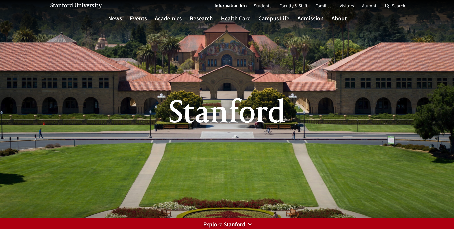
10. Stanford University
Like Harvard, Stanford’s website design is elegant and minimalistic, prioritizing a clean layout that allows users to focus on the information they seek without being overwhelmed by visual clutter.
This website’s standout features include:
- Concise, accessible copy. Stanford resists the urge to wax eloquent, opting for succinct and highly readable copy that communicates key messages with ease.
- Relevant images. Images complement the web copy, enhancing the user's understanding and engagement while creating a pleasing, vibrant aesthetic.
- Great navigation and clear CTAs. Stanford's website features an intuitive and well-structured navigation system, combined with well-placed CTAs that drive visitors toward action.
ImageX Can Design a Higher Ed Website That Sets Your Institution Apart
When it’s time to stop scrolling for inspiration and start devising a digital solution that will drive your college or university forward, you’ll need the right partner at your side.
The team at ImageX has extensive experience building enterprise-level solutions for educational institutions with complex needs. We’d love to help your organization, too.